AWS Infrastructure Migration: Results
 Ian
~ July 17, 2017
Ian
~ July 17, 2017
In this article, we’ll describe some of the performance impacts of the AWS infrastructure migration we performed recently.
State before and after migration
Before the migration, MemCachier clusters mostly used EC2-Classic instances, i.e. instances not in a VPC. The monitor machines (used for measuring cluster latencies) were rebuilt recently, and were in VPCs.
After the migration, all cluster machines are in VPCs, with one subnet per availability zone, and one security group per cluster. The monitor machines are still in the same VPCs as before. For regions with clusters in multiple AZs, this means that some latency measurements are intra-AZ measurements and some are cross-AZ measurements.
Measuring latencies
We continually (every 10 seconds) measure get, set and proxy latencies to a test cache in each cluster. The latency measurements are done using normal memcached protocol requests from the monitor machine, which is in a different VPC to the cluster EC2 instances. The idea here is to represent a reasonably realistic setup in terms of the distance from the client (monitor) machine to the cluster, replicating what a real customer client would see.
Get, set and proxy latency values are measured independently at each sampling time. (This will be relevant later, when we want to try to remove the latency to the proxy from the get and set values in order to get some idea of the intra-cluster latency.)
The raw latency data usually looks something like this (from a machine chosen at random):
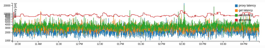
There’s some natural variability in the raw latency values, and as is usual with these kinds of network propagation time measurements, there is a long tail towards larger latency values (the axis scale here is logarithmic, so the spikes in the latency graph are really quite significant).
We use daily latency averages to visualize longer-term trends. The last few months of data from a machine in the US-East-1 region look like this:
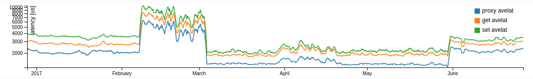
Although averaging hides important features of the latency distribution, there are some interesting long-term secular trends in the averages. For US-East-1, there are four distinct periods visible since the beginning of 2017. We did the VPC migration for US-East-1 at the beginning of June, which explains the change there. The period from mid-February until early March with higher average latencies was a period where we believe the monitor machine for US-East-1 was suffering from a “noisy neighbor” (where another EC2 instance on the same physical server as our monitor instance exhibits intermittently high loads, either on CPU or network communications, interfering with the performance of the monitor process). In early March, we launched a new monitor instance (with a larger instance type), which made this problem go away. The period between launching this new monitor instance and when we performed the VPC migration has anomalously good latency values, which we think is just down to “luck” in the placement of the new monitor instance in relation to the EC2-Classic instances that were hosting our servers at that time.
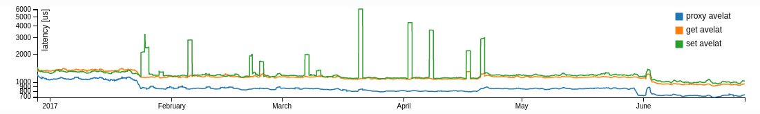
Average latencies from a machine in the EU-West-1 region show much less long-term variation, although there are still some secular changes that aren’t associated with anything that we did:
Empirical latency CDFs
Comparing time series plots of averaged latencies shows some long-term trends, but it hides the interesting and important part of the distribution of latency values. It’s an unfortunate fact of life that the most important part of the distribution of latency values is the hardest to examine. These important values are the rarer large latency values lying in the upper quantiles of the latency distribution. To understand why these are important, consider an application that, in order to service a typical user request, needs to read 50 items from its MemCachier cache (to make this concrete, think of a service like Twitter that caches pre-rendered posts and needs to read a selection of posts to render a user’s timeline). Let’s think about the 99.9% quantile of the latency distribution, i.e. the latency value for which 999/1000 requests get a quicker response. This seems like it should be a pretty rare event, but if we make 50 requests in a row, the probability of getting a response quicker than the 99.9% quantile for all of them is (0.999)^5 = 0.951. This means that 5% of such sequences of requests will experience at least one response as bad as the 99.9% quantile, and this slowest cache response will delay the final rendering of the response to the user.
One way of visualizing the whole distribution of latency values is using the empirical cumulative distribution function (CDF). The CDF of a distribution is the function F(x) = P(X > x) that gives the probability that the value of a random variable X sampled from the distribution is larger than a given value x. To calculate an empirical estimate of the CDF of a distribution from a finite sample from the distribution, we just count the fraction of data values larger than a given value. As usual with this sort of empirical distribution estimation, what you get out is just an approximation to the true CDF: if you have enough data, it’s pretty good in the “middle” of the distribution, but you suffer a bit from sampling error in the tails of the distribution (just because there are naturally less data samples in the tails).
The following figures show the empirical CDFs for the get, set and proxy latency for a couple of machines, one in a cluster in US-East-1 and one in EU-West-1. Colours distinguish CDFs for three different 3-day time periods (one each immediately before and after the infrastructure migration and one earlier on, to show the “normal” situation for the US-East-1 region), and line thicknesses distinguish between get, set and proxy values. Latencies are measured in microseconds and are plotted on a logarithmic scale. (The scale is cut off at the right-hand end, excluding the very largest values, since this makes it easier to see what’s going on.)
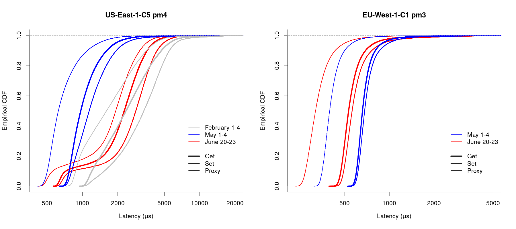
These two plots are pretty indicative of what’s seen for all of our machines. There’s a split between US-East-1 and the other regions, with latencies in the other regions being consistently lower after the migration than before: in the right-hand plot above, each of the red (after migration) “get”, “set” and “proxy” curves are to the left (i.e. lower latency values) of the corresponding blue (before migration) curve. The higher quantiles for these regions are consistently lower after the migration than before.
US-East-1 is a little different. Overall, performance as measured by latency values is comparable after the migration to what we saw in February, but the CDFs from after the migration have an extra kink in them that we can’t explain, as seen in the red curves on the left-hand plot above. We also have this period through most of February where we had very low latency values, almost certainly down to some lucky eventuality of placement of the new monitor machine that we launched. It’s interesting to see that the lowest latency values after the migration match up well with the lowest values seen during the “good” period, but the larger values correspond more closely with what we saw in February. It’s our belief that this is an artefact of the underlying AWS networking infrastructure. We’ll continue to keep an eye on this and might try starting a new monitoring instance to see if that leads to better results (here, “better” mostly means “more understandable”).
The get and set latency values shown in the CDFs above include both the time taken for a memcached protocol message to get to and from the proxy server that the monitor connects to and the time taken for communication between the proxy server and the involved cache backend server. Measuring intra-cluster latencies, i.e. that communication time between proxy and cache backend, is complicated by the independent sampling of set, get and proxy latency at each sample time. (There is obviously some correlation between the different quantities, since the long-term variability seen above in the average latency values appears to occur synchronously in each quantity, but this is swamped by stochastic variability at short time-scales.)
One thing we can do though is to look at differences in the CDFs. We basically just take the difference between (for example) the get latency and the proxy latency for each quantile value and call this the “intra-cluster get latency CDF”. The figure below shows these “difference CDFs” for get and set latency for the same two machines shown in the CDF composite plot above.
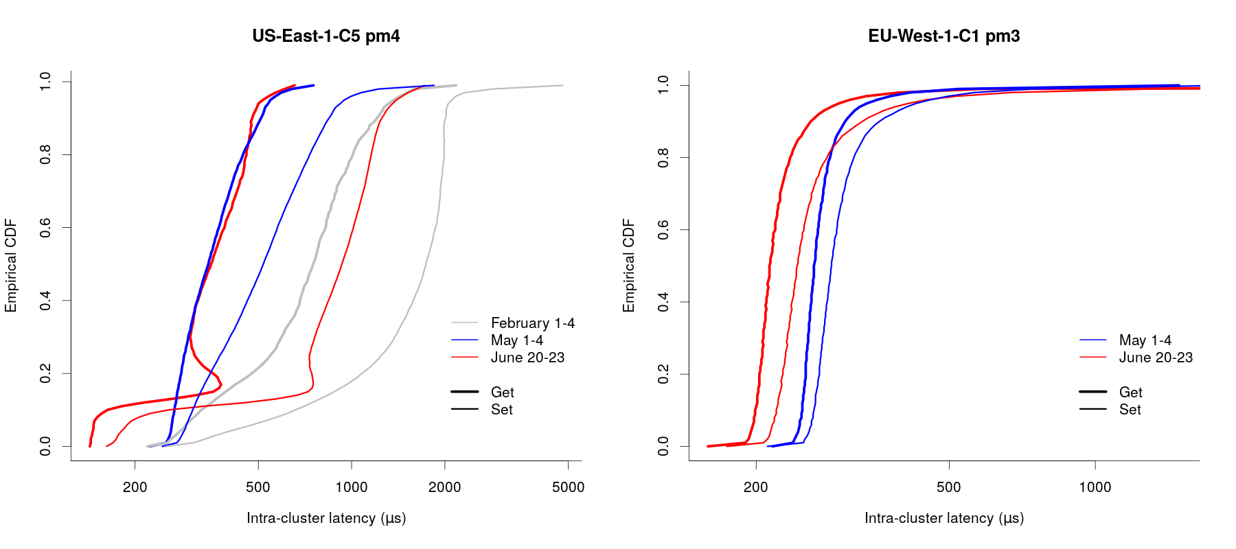
The EU-West-1 results are comparable to what we see for all machines outside US-East-1: intra-cluster get and set latencies are reduced after the migration compared to before. The situation in US-East-1 is more complicated, but the plot here is representative of what we see: intra-cluster get latencies are better or the same as the “good” period, while intra-cluster set latencies are less good, but comparable to what we saw in February. This is slightly different to what we saw in the composite CDF plots, where get, set and proxy latencies were all worse after the migration than during the “good” period. We speculate that this is just down to differences in the route taken by memcached requests from the monitor machine to the proxies in US-East-1 now that the proxies are all on machines in a VPC (as opposed to being on EC2-Classic instances). We’re still working on understanding exactly what’s going on here, and are continuing monitoring of the latency behaviour in US-East-1.
Conclusions
The kind of latency measurements that we use to monitor MemCachier performance are very susceptible to small variations in network infrastructure. This makes them a sensitive measuring tool (indeed, we use rules based on unexpected latency excursions for alerting to catch and fix networking problems early), but it can make them difficult to understand.
It seems that the most significant factor in latency behaviour really is “luck” related to infrastructure placement. This can be seen both from the existence of this “good” period in US-East-1 for which we have no other reasonable explanation, and from the long-term secular changes in latencies that we presume must be associated with changes within the AWS infrastructure (either networking changes, or the addition or removal of instances on the physical machines that our instances are hosted on). This unpredictability is the price you pay for using an IaaS service like AWS.
From the perspective of the infrastructure migration, we are quite satisfied with the performance after migration. All regions except for US-East-1 are clearly better than before, and while the results in US-East-1 are a little confusing, performance is better than it was in February, and from some perspectives is comparable even to the “lucky good period” that we had.